

TechLabs Redesign
TechLabs Redesign
a website redesign for a global NGO with the mission of democratizing tech education
a website redesign for a global NGO with the mission of democratizing tech education
Role
Role
Lead UX designer
Lead UX designer
Timeline
Timeline
6 weeks
6 weeks
Tools
Tools
Figma, Google Forms, Maze
Figma, Google Forms, Maze
Team
1 project manager + 2 developers
1 project manager + 2 developers
Summary
Summary
The problem
The problem
Users experience information overload and poor navigability on TechLabs' current site. Additionally, the individual location pages were inconsistent with one another.
Users experience information overload and poor navigability on TechLabs' current site. Additionally, the individual location pages were inconsistent with one another.
The solution
The solution
A redesigned website with better information hierarchy and new copy. Individual location pages are also standardized to follow the same format for cohesive UX and branding.
A redesigned website with better information hierarchy and new copy. Individual location pages are also standardized to follow the same format for cohesive UX and branding.

Background
Background
TechLabs works to bridge the digital skills gap.
This NGO is led by volunteers looking to create a community of digital shapers, people who leverage their technical skills to solve the world’s most pressing challenges. They offer programs with various tracks to equip individuals with domain knowledge and soft skills to revolutionize the workforce.
This NGO is led by volunteers looking to create a community of digital shapers, people who leverage their technical skills to solve the world’s most pressing challenges. They offer programs with various tracks to equip individuals with domain knowledge and soft skills to revolutionize the workforce.
However, their current site leaves a gap of knowledge.
The vice chairwoman approached me to redesign their site as there was an uptick in people not being able to find the information they need with ease. Their goal was to build their new website from scratch to attract the next generation of digital shapers.
The vice chairwoman approached me to redesign their site as there was an uptick in people not being able to find the information they need with ease. Their goal was to build their new website from scratch to attract the next generation of digital shapers.
How might we redesign the TechLabs site to be easier to navigate?
How might we redesign the TechLabs site to be easier to navigate?
User research
User research
Identifying what could be improved
Identifying what could be improved
Before joining the team, TechLabs conducted a survey on current techies to assess the navigability of their current site. They decided on a survey to get as many responses as possible from their diverse student population and to receive some quantitative data. The survey had 20 respondents.
Some key insights from the survey were:

65%
65%
reported poor navigation on the site
reported poor navigation on the site
as they indicated 3 or less when rating the navigability
as they indicated 3 or less when rating the navigability
25%
25%
reported missing/outdated information
reported missing/outdated information
“Not clear on what the programs have to offer”
“Not clear on what the programs have to offer”

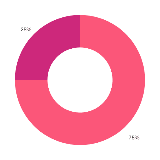
35%
35%
reported experiencing information overload
reported experiencing information overload
“Bit of a flood of information”
”Less text!”
“Bit of a flood of information”
”Less text!”
These findings imply that improved copy and information hierarchy are key to the redesign.
These findings imply that improved copy and information hierarchy are key to the redesign.
I also did a quick audit of their current site to resonate with the sentiments from the survey respondents and see if there are other areas of improvement I could identify.
I also did a quick audit of their current site to resonate with the sentiments from the survey respondents and see if there are other areas of improvement I could identify.
On the homepage, they list key benefits of the Digital Shaper program, but there’s no mention of their other program, #codeathome Bootcamp. This could attribute to the stat of missing information.
On the homepage, they list key benefits of the Digital Shaper program, but there’s no mention of their other program, #codeathome Bootcamp. This could attribute to the stat of missing information.

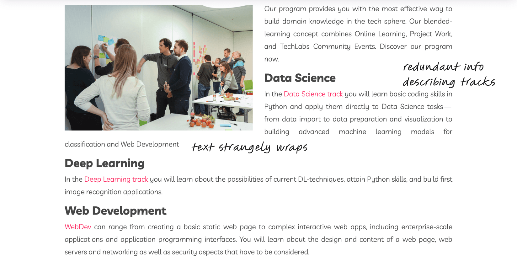
In the Hamburg page, there’s a lot of text that wraps around the photo, making it difficult to read. Additionally, this particular section is redundant as the tracks are described in detail on other pages and every location has the same curriculum for these tracks.
In the Hamburg page, there’s a lot of text that wraps around the photo, making it difficult to read. Additionally, this particular section is redundant as the tracks are described in detail on other pages and every location has the same curriculum for these tracks.
There are also a lot of inconsistencies between the locations. This can disadvantage some users as they may not have access to same CTAs and content for their city, creating a disjointed and confusing experience.
There are also a lot of inconsistencies between the locations. This can disadvantage some users as they may not have access to same CTAs and content for their city, creating a disjointed and confusing experience.

Information architecture
Information architecture
Establishing better hierarchy
Establishing better hierarchy
Since users were having trouble in navigating the current site, I audited the original information architecture to identify where the points of confusion could be.
Since users were having trouble in navigating the current site, I audited the original information architecture to identify where the points of confusion could be.

Information architecture for the original website
Information architecture for the original website
Points I found confusing or redundant are indicated by the question marks. A couple that stood out to me were:
Points I found confusing or redundant are indicated by the question marks. A couple that stood out to me were:
Variations in location information
In the several locations I explored, no location is the same in the content they present and how that information is organized.
In the several locations I explored, no location is the same in the content they present and how that information is organized.
Repeating information
In different pages, one topic is mentioned earlier and then additional information about the same topic can be found later in the page.
In different pages, one topic is mentioned earlier and then additional information about the same topic can be found later in the page.
I then created a new information architecture for the redesign. The goal with this new IA would be to consolidate the information, standardize location information, and create better hierarchy overall.
I then created a new information architecture for the redesign. The goal with this new IA would be to consolidate the information, standardize location information, and create better hierarchy overall.

Information architecture for the redesign
Information architecture for the redesign
Ideation
Ideation
Translating IA to wireframes
Translating IA to wireframes
After presenting the new information architecture with my PM to ensure that it covered all the elements needed to accurately portray everything TechLabs offers, I started translating the main pages into mid-fidelity wireframes.
As per discussion with the engineers, I started with the mobile version of the redesign for responsive design.

Mobile mid-fidelity wireframes
Mobile mid-fidelity wireframes
I then moved onto the desktop version and iterated upon the wireframes based on any comments left by my PM.
I then moved onto the desktop version and iterated upon the wireframes based on any comments left by my PM.

Desktop mid-fidelity wireframes
Desktop mid-fidelity wireframes
UX copywriting
UX copywriting
Dabbling in content creation
Dabbling in content creation
With help from the marketing team, we created new content for the redesign so that it’s more concise to avoid information overload. I tried my hand at copywriting to iterate on the new content so that it didn’t include redundant information or too much flourishing language that can confuse users.
With help from the marketing team, we created new content for the redesign so that it’s more concise to avoid information overload. I tried my hand at copywriting to iterate on the new content so that it didn’t include redundant information or too much flourishing language that can confuse users.
My edits to the new copy
My edits to the new copy
At TechLabs, we're a group of passionate and driven individuals who are dedicated to creating a collaborative community of Digital Shapers. Our team is committed to providing exciting meetups, hackathons, resources, socials, and workshops that will inspire and empower you to reach your full potential in the tech world. With our dynamic and inclusive community, you'll have access to the tools, resources, and support you need to thrive. Join us now and discover the world of TechLabs - where innovation and collaboration are always at the forefront!
At TechLabs, we're a group of passionate and driven individuals who are dedicated to creating a collaborative community of Digital Shapers. Our team is committed to providing exciting meetups, hackathons, resources, socials, and workshops that will inspire and empower you to reach your full potential in the tech world. With our dynamic and inclusive community, you'll have access to the tools, resources, and support you need to thrive. Join us now and discover the world of TechLabs - where innovation and collaboration are always at the forefront!
Usability testing
Usability testing
Learning from our users
Learning from our users
To assess if the navigability and content of the redesign have improved, we conducted unmoderated usability testing through Maze. Our priority was to get impressions on:
Homepage
Programs page
Specific location page
Volunteers page
as those contain the most pertinent information and CTAs to someone interested in joining TechLabs.
Out of our 12 participants, an average of 76.7% had direct or indirect success on the tasks. Many participants cited that the redesign is “easy to navigate” with “short, easy to read paragraphs.”

Usability testing insights
Usability testing insights
The redesign seems pretty successful so far, but there was definitely room for improvement:
The redesign seems pretty successful so far, but there was definitely room for improvement:
Impactful hierarchy
Impactful hierarchy
Some users suggested reordering some of the sections to leave a more lasting impression on potential techies.
Some users suggested reordering some of the sections to leave a more lasting impression on potential techies.
Stronger hero
Stronger hero
One user wanted more of a wow factor in the hero of the landing page so we can really grab people’s attention.
One user wanted more of a wow factor in the hero of the landing page so we can really grab people’s attention.
Ambiguity in volunteering
Ambiguity in volunteering
The difference between volunteering globally vs. volunteering locally needs to be more distinct from the start.
The difference between volunteering globally vs. volunteering locally needs to be more distinct from the start.
Avoid long laundry lists
Avoid long laundry lists
A few users mentioned that it’s not cognitively helpful to have the long lists of positions that need to be clicked into.
A few users mentioned that it’s not cognitively helpful to have the long lists of positions that need to be clicked into.
Iteration
Iteration
Addressing user feedback
Addressing user feedback
Here are some before and afters of the major priority revisions I made for the website.
Here are some before and afters of the major priority revisions I made for the website.
1. Impactful hierarchy
1. Impactful hierarchy
To have a more lasting impression on potential techies:
To have a more lasting impression on potential techies:
Moved “Our impact” up on the Programs page
Moved “Our impact” up on the Programs page
1
Moved “Why join us?” up on the Volunteers page
Moved “Why join us?” up on the Volunteers page
2

2. Stronger hero
2. Stronger hero
To grab people’s attention on the landing:
To grab people’s attention on the landing:
Enlarged the image to full width of the desktop
Enlarged the image to full width of the desktop
1
Will be working with our engineering team to animate the text on the hero image
Will be working with our engineering team to animate the text on the hero image
2

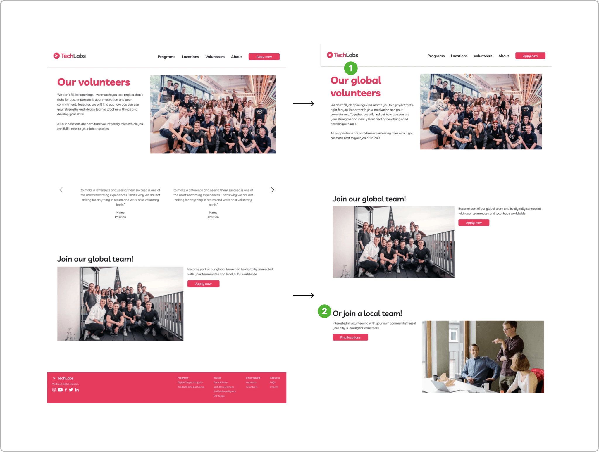
3. Ambiguity in volunteering
3. Ambiguity in volunteering
To distinguish volunteering globally vs. locally:
To distinguish volunteering globally vs. locally:
Included “global” into the heading of the page
Included “global” into the heading of the page
1
Added a section for volunteering locally to prompt users to visit their city’s page for more information
Added a section for volunteering locally to prompt users to visit their city’s page for more information
2
4. Avoid long laundry lists
4. Avoid long laundry lists
To prevent users from having to click into several accordions:
To prevent users from having to click into several accordions:
Replaced the accordion list with a new component for different volunteering positions
Replaced the accordion list with a new component for different volunteering positions
1

Final solution
Final solution
Introducing the TechLabs redesign
Introducing the TechLabs redesign
Here's a video of the prototype.
Here's a video of the prototype.
And here are a few before and afters of the current site vs. the redesign.
And here are a few before and afters of the current site vs. the redesign.
Landing
Landing
The redesigned landing has a stronger hero image that’s more captivating and modern. Additionally, the content on the landing is more informative about what TechLabs has to offer.
The redesigned landing has a stronger hero image that’s more captivating and modern. Additionally, the content on the landing is more informative about what TechLabs has to offer.

Programs
Programs
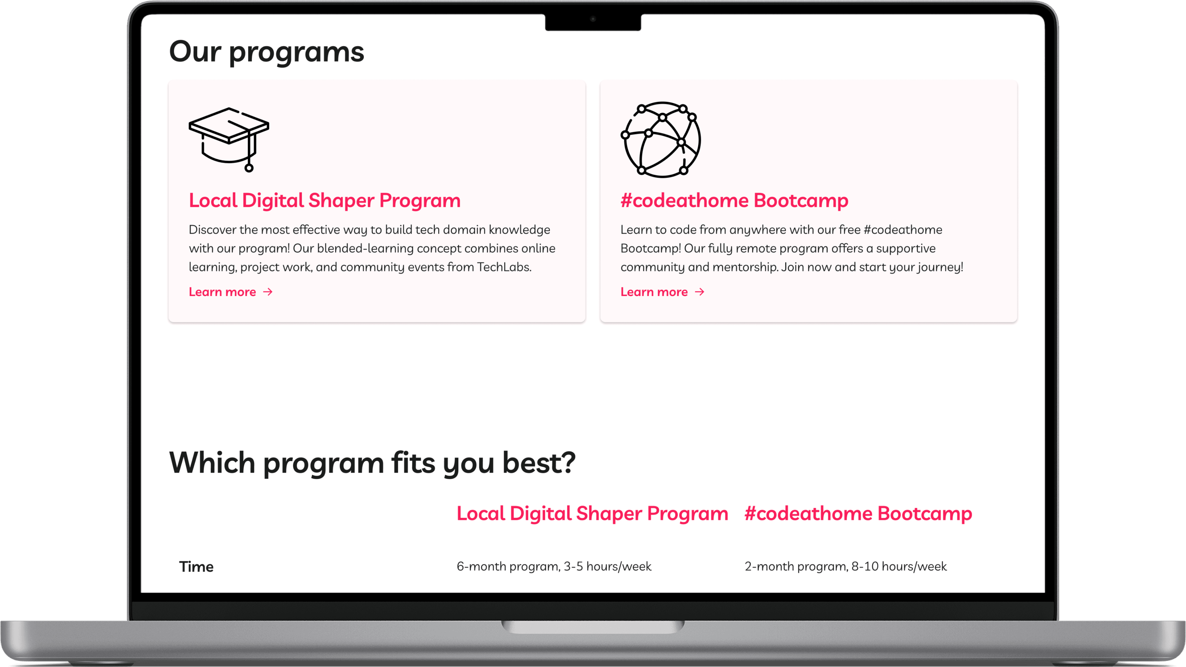
The Programs page has been redesigned to include relevant and necessary information on the two separate programs Techlabs has. The brief descriptions and comparison chart will help prospective students be able to differentiate between the two and help them determine which program fits them best at a glance.
The Programs page has been redesigned to include relevant and necessary information on the two separate programs Techlabs has. The brief descriptions and comparison chart will help prospective students be able to differentiate between the two and help them determine which program fits them best at a glance.

Additionally, CTAs were added in the accordion for each of the tracks to increase accessibility as the only way to access those pages in the current site was through a dropdown in the navbar.
Additionally, CTAs were added in the accordion for each of the tracks to increase accessibility as the only way to access those pages in the current site was through a dropdown in the navbar.

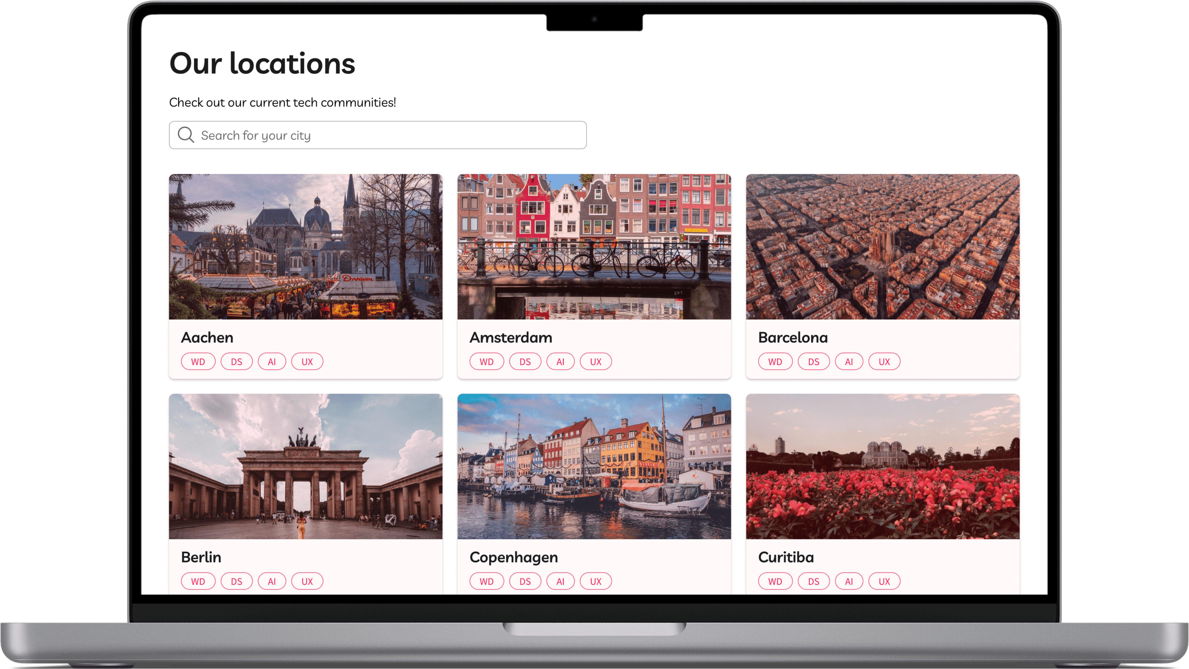
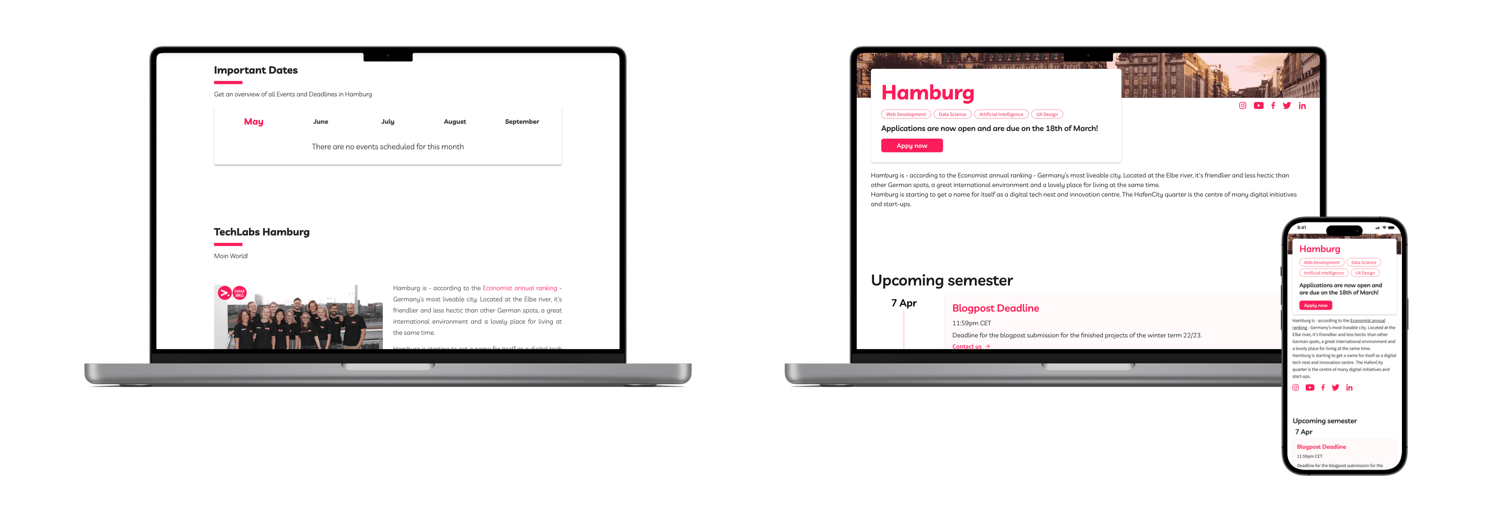
Location
Location
Each of the location’s pages will be standardized to avoid redundant information as well as information overload. Additionally, important dates has been redesigned as a vertical semester timeline so that it’s more mobile-friendly.
Each of the location’s pages will be standardized to avoid redundant information as well as information overload. Additionally, important dates has been redesigned as a vertical semester timeline so that it’s more mobile-friendly.
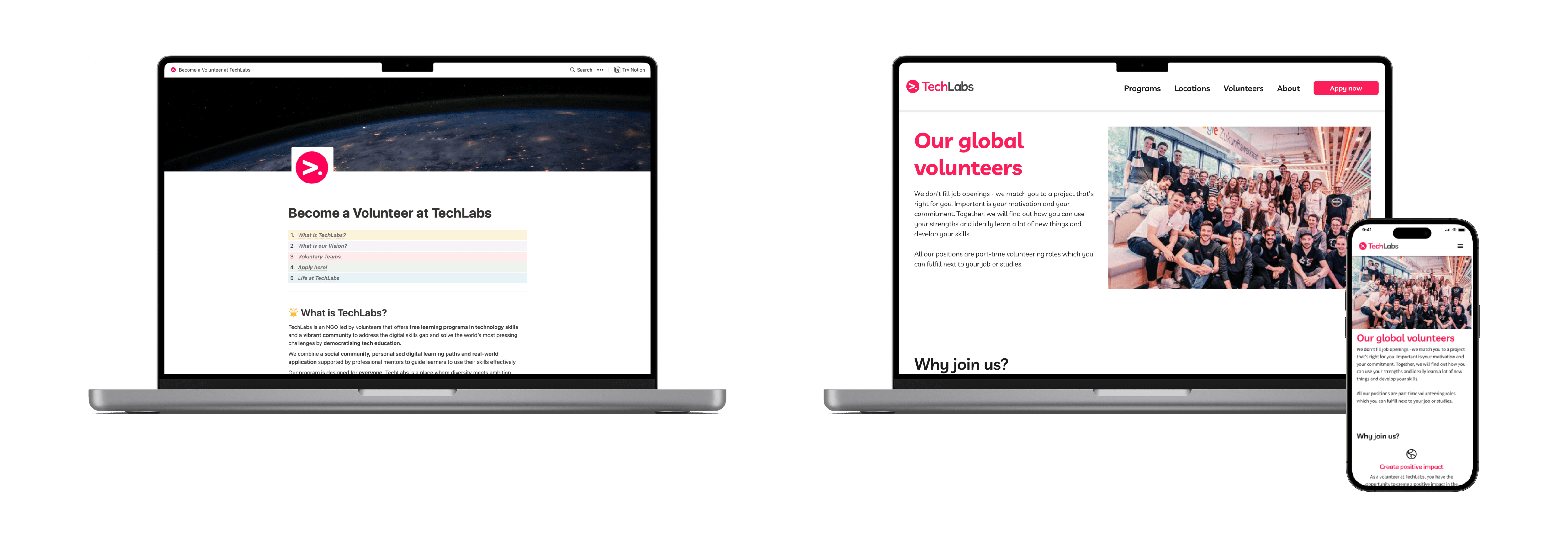
Volunteers
Volunteers
One of the biggest changes in the redesign is ditching the Notion page for volunteering information and integrating it into the website. This allows all the information to be centralized in one site, making the experience more cohesive.
One of the biggest changes in the redesign is ditching the Notion page for volunteering information and integrating it into the website. This allows all the information to be centralized in one site, making the experience more cohesive.
Reflection
Reflection
My takeaways
My takeaways
What did I learn?
What did I learn?
I learned the importance of good copy and why it takes some time to develop. Content can inform what UI patterns to leverage, which then influences the overall UX of a product. Having useful, concise copy not only tells the users what they need to know, but also helps move them along smoothly in their journey.
I learned the importance of good copy and why it takes some time to develop. Content can inform what UI patterns to leverage, which then influences the overall UX of a product. Having useful, concise copy not only tells the users what they need to know, but also helps move them along smoothly in their journey.
What are some next steps?
What are some next steps?
The new copy for the redesign still needs some polishing, especially given some feedback from usability testing. The redesign is also currently under development and I look forward to collaborating with engineers to see how we can make the site more dynamic with animations.
It was awesome to be part of this group of volunteers passionate about lowering the barrier to tech education. I look forward to seeing more of the amazing work TechLabs is doing and helping out wherever I can!