

sproul.club
sproul.club
a platform to help Berkeley students virtually advertise and discover campus organizations
a platform to help Berkeley students virtually advertise and discover campus organizations
Role
Role
Product designer
Product designer
Timeline
Timeline
6 months
6 months
Tools
Tools
Figma, Google Forms
Figma, Google Forms
Team
2 project managers + 4 designers + 6 developers
2 project managers + 4 designers + 6 developers
Summary
Summary
The problem
The problem
The COVID-19 pandemic made it more difficult for Berkeley students to find campus clubs to join and pertinent recruitment information, which ultimately limits their student experience.
The COVID-19 pandemic made it more difficult for Berkeley students to find campus clubs to join and pertinent recruitment information, which ultimately limits their student experience.
The solution
The solution
An online platform that helps students discover clubs that are aligned with their interests and organize all this important recruitment information.
An online platform that helps students discover clubs that are aligned with their interests and organize all this important recruitment information.


Background
Background
The COVID-19 pandemic affected the Berkeley student experience beyond just taking classes remotely.
The COVID-19 pandemic affected the Berkeley student experience beyond just taking classes remotely.
Traditionally, clubs at Berkeley would flyer students on Sproul Plaza to promote their on-campus organizations/clubs. However, obviously due to the pandemic, this was no longer possible.
Traditionally, clubs at Berkeley would flyer students on Sproul Plaza to promote their on-campus organizations/clubs. However, obviously due to the pandemic, this was no longer possible.
This created a two-fold problem.
This created a two-fold problem.
It became difficult for students, especially incoming freshmen and transfers, to discover what clubs existed and for club admin to reach a larger demographic for member recruitment.
It became difficult for students, especially incoming freshmen and transfers, to discover what clubs existed and for club admin to reach a larger demographic for member recruitment.
How might we better support students in virtually finding campus organizations to join?
How might we better support students in virtually finding campus organizations to join?
User research
User research
Understanding the users & problem space
Understanding the users & problem space
The Beta version of sproul.club launched in August 2021. Their preliminary research assessed how students feel about discovering clubs and how club admin feel about the current platforms (i.e. Callink, Facebook, Instagram) used to advertise clubs. Club admin are also students, but lead their respective organizations.
Key takeaways from students were:

Current platforms are overwhelming, decentralized, and lack relevant information regarding the application.
Current platforms are overwhelming, decentralized, and lack relevant information regarding the application.

It’s difficult to discover new clubs as this is dependent on who you follow on these social media apps.
It’s difficult to discover new clubs as this is dependent on who you follow on these social media apps.
And key takeaways from club admin were:
And key takeaways from club admin were:

Current platforms lack reach to new audiences and can easily scatter events and recruitment info.
Current platforms lack reach to new audiences and can easily scatter events and recruitment info.

Callink, the school-sponsored site, is disorganized and is outdated for the organization’s current needs.
Callink, the school-sponsored site, is disorganized and is outdated for the organization’s current needs.
We concluded that current platforms failed students in displaying personalized, pertinent information regarding club recruitment in a centralized way.
Since we would be working with two different user types, we created two personas to zero in on their individual needs and help us better inform our design direction.

Studious Sophomore user persona
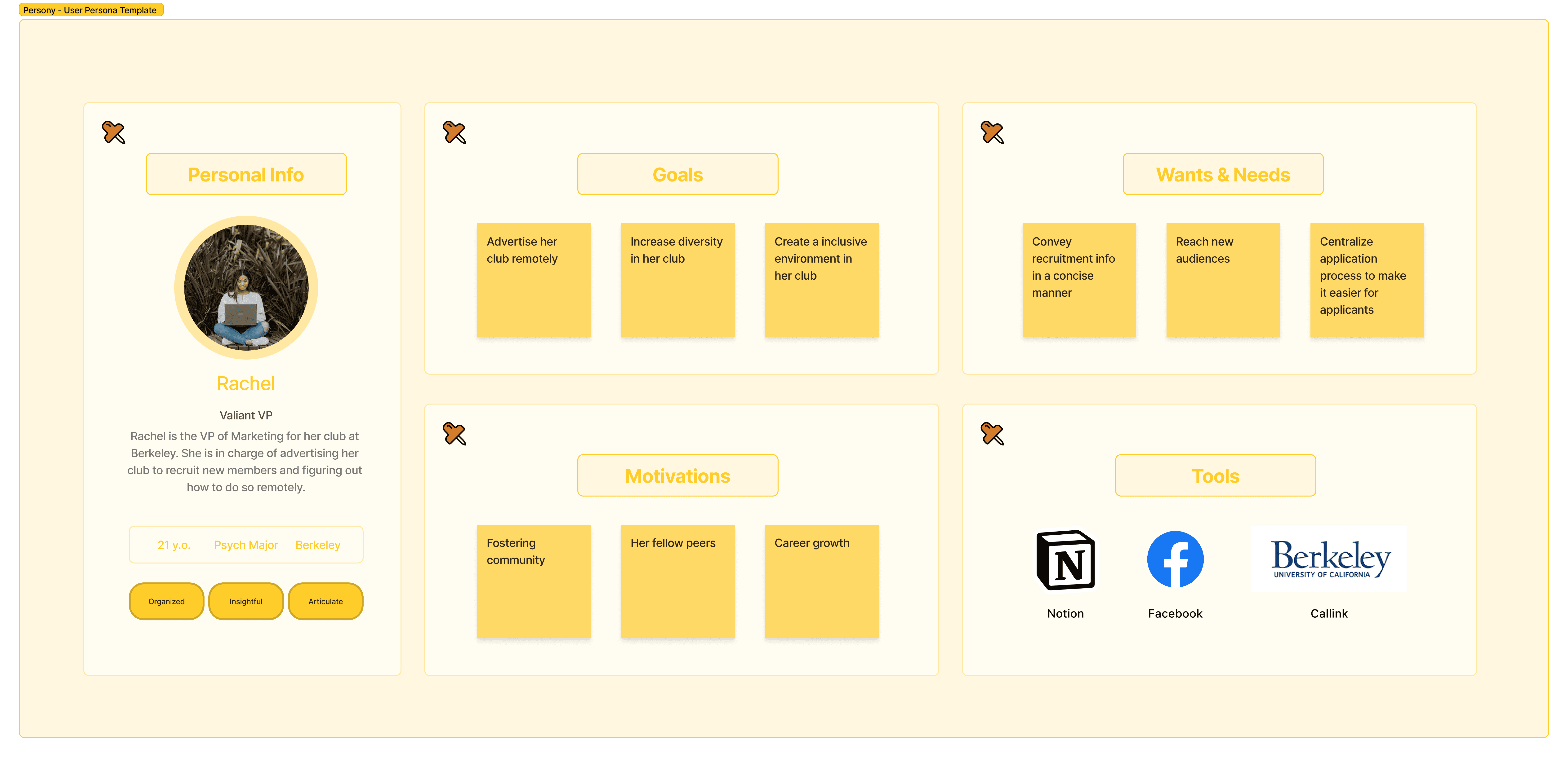
Valiant VP user persona
Define
Define
Identifying how we could help
Identifying how we could help
The original team of sproul.club did not have any product designers. So the first task for my team was to survey students to get quantitative data on what attributes of an organization are important for them to know when looking at the club page. We decided to use surveys since we have a large student body on campus and wanted to receive as many responses as possible to better reflect our diverse population.
Our survey had 105 responses.

Survey results assessing what’s important to students
Survey results assessing what’s important to students
The above results demonstrate that recruitment information, club culture, and club type are the attributes that are very important for users to know. Additionally, users are satisfied with the overall platform experience as it stands.
We then mind mapped the detailed responses and suggestions from the survey to identify the priority revisions needed for the club page.
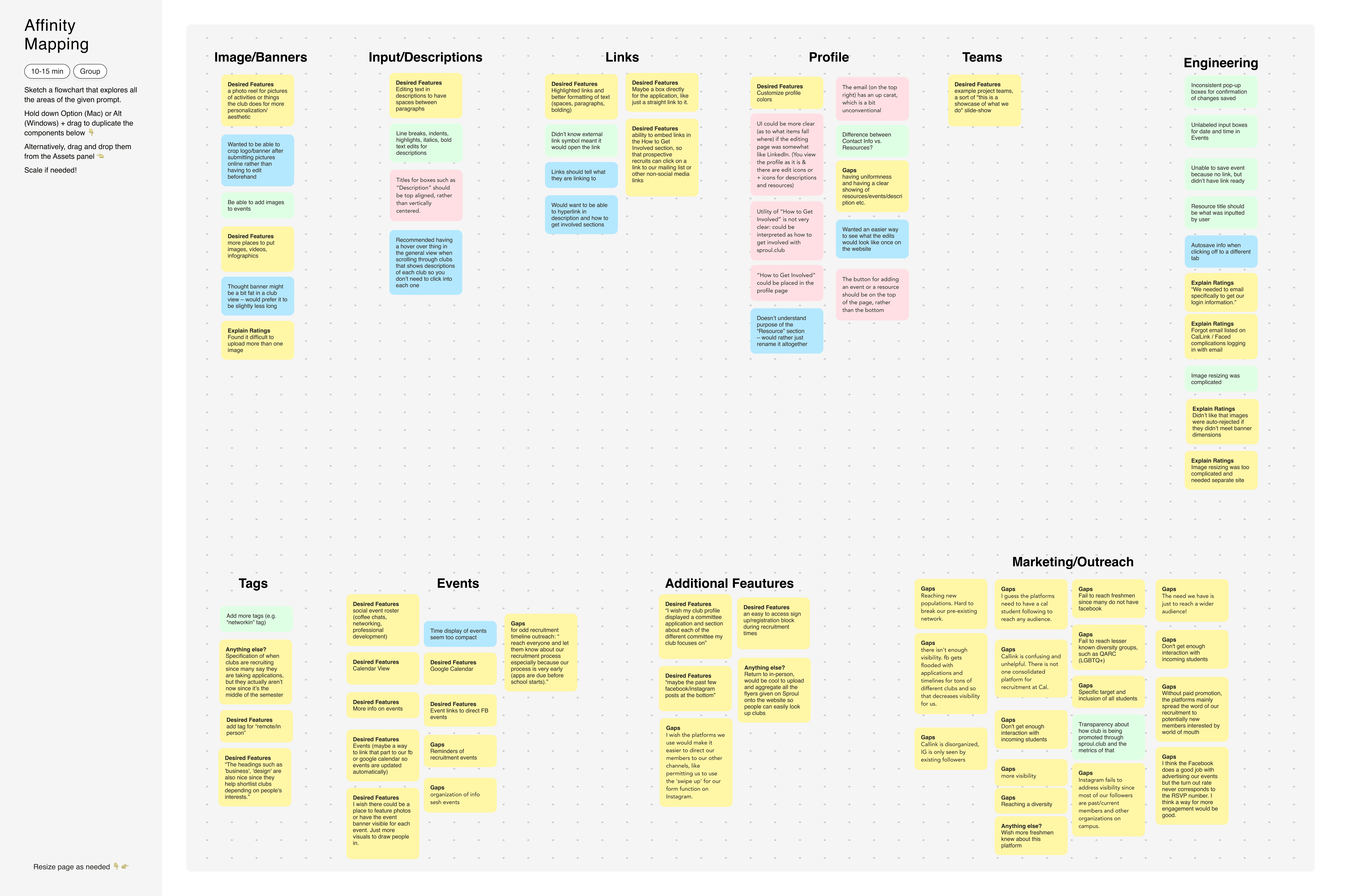
Mind map of survey results
Some suggestions we received that could address the aforementioned attributes were:
Some suggestions we received that could address the aforementioned attributes were:
Gallery
Gallery
An additional place to upload photos could help clubs convey what their community is like and document their history.
An additional place to upload photos could help clubs convey what their community is like and document their history.
Timeline of events
Timeline of events
Some type of feature that could help students easily follow and track which recruitment events are coming up would be extremely valuable to them.
Some type of feature that could help students easily follow and track which recruitment events are coming up would be extremely valuable to them.
Additionally, we wanted to expand our platform to be more inclusive of the whole student body.
Additionally, we wanted to expand our platform to be more inclusive of the whole student body.
So we brainstormed the idea of an applicant dashboard. This idea was validated as 68.6% of the survey respondents were interested in a new account for applicants specifically. We used the same form to receive feedback on what features in the dashboard would interest students most.
So we brainstormed the idea of an applicant dashboard. This idea was validated as 68.6% of the survey respondents were interested in a new account for applicants specifically. We used the same form to receive feedback on what features in the dashboard would interest students most.

Survey results for potential applicant profile feature
Survey results for potential applicant profile feature
From this, we determined what an applicant wants to do/see on their dashboard. This includes:
From this, we determined what an applicant wants to do/see on their dashboard. This includes:
Favoriting clubs
Favoriting clubs
This will aid students in saving clubs for future reference in a centralized area.
This will aid students in saving clubs for future reference in a centralized area.
Timeline for events
Timeline for events
This allows students to easily keep track of upcoming recruitment events.
This allows students to easily keep track of upcoming recruitment events.
Application tracker
Application tracker
This will help students know where they are in the process and stay organized.
This will help students know where they are in the process and stay organized.
Our intention is for sproul.club to act be the one-stop-shop for club recruitment at Berkeley. Everything related to recruitment will be centralized in one place, alleviating the stress and confusion for students so that they can focus on the recruiting itself.
Our intention is for sproul.club to act be the one-stop-shop for club recruitment at Berkeley. Everything related to recruitment will be centralized in one place, alleviating the stress and confusion for students so that they can focus on the recruiting itself.
Ideation
Ideation
Making our vision come to life
Making our vision come to life
With 4 other product designers on the team, we leveraged divergent thinking to brainstorm different ways to iterate upon the current club page and develop the new features.
With 4 other product designers on the team, we leveraged divergent thinking to brainstorm different ways to iterate upon the current club page and develop the new features.

Mid-fidelity iterations of updated club page
Mid-fidelity iterations of updated club page
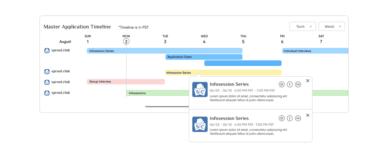
We collectively thought a horizontal timeline would be best to display the recruitment events, as evidenced above in the mid-fidelity wireframes. However, our PMs brought it to our attention that 60% of our users occasionally access the platform on their mobile devices. So we iterated on the timeline to be vertical to be more mobile-friendly.
Then, we used a similar approach of divergent thinking to design the new applicant dashboard, with many iterations particularly for the event timeline.


Mid-fidelity iterations of the applicant dashboard’s timeline
Mid-fidelity iterations of the applicant dashboard’s timeline
For both the club page and dashboard, we converged to give each other feedback on our mid-fidelity wireframes and pushed the screens to high-fidelity mockups together.
For both the club page and dashboard, we converged to give each other feedback on our mid-fidelity wireframes and pushed the screens to high-fidelity mockups together.
Usability testing
Usability testing
Learning directly from our users
Learning directly from our users
Before we did the overhaul on the club page, we conducted some usability testing sessions to assess the intuitiveness of the current platform. I was assigned to evaluate the task of editing the club page on club admin who already have an account with us.
Some key pain points were:
Before we did the overhaul on the club page, we conducted some usability testing sessions to assess the intuitiveness of the current platform. I was assigned to evaluate the task of editing the club page on club admin who already have an account with us.
Some key pain points were:
Purpose of sections
Purpose of sections
Some users questioned the utility and purpose of the “How to Get Involved” and “Resources” sections as they couldn’t distinguish between the two or weren’t sure what content should live there.
Some users questioned the utility and purpose of the “How to Get Involved” and “Resources” sections as they couldn’t distinguish between the two or weren’t sure what content should live there.
Need for success indicators
Need for success indicators
Many users were unsure if the edits they made on their club page were successfully saved
in the backend as there were no notifications that told them
if their changes were saved.
Many users were unsure if the edits they made on their club page were successfully saved
in the backend as there were no notifications that told them
if their changes were saved.
Information overload
Information overload
Club admin wanted to have rich text formatting in the descriptions as line breaks and additional styling can help potential applicants digest the information easier.
Club admin wanted to have rich text formatting in the descriptions as line breaks and additional styling can help potential applicants digest the information easier.
I also conducted usability testing on the student dashboard. We wanted to test:
The general layout of the dashboard
The intuitiveness of the application tracker board (kanban board)
If users could find where the “Favorites” page lived
100% of users were able to find their favorites under their Account. Some additional key insights I received were:
Clutter at the top of the dashboard
Clutter at the top of the dashboard
Some users noted that the top of the dashboard with 2 columns for events felt cluttered and unnecessary compared to the rest of the dashboard.
Some users noted that the top of the dashboard with 2 columns for events felt cluttered and unnecessary compared to the rest of the dashboard.
Confusion over kanban
Confusion over kanban
Confusion over the kanban board
When people see a kanban board, they automatically think they can drag and drop the cards. Many users performed this task without even noticing the arrows.
When people see a kanban board, they automatically think they can drag and drop the cards. Many users performed this task without even noticing the arrows.
Leverage familiar UIs
Leverage familiar UIs
Users prefer a calendar view to a timeline view for upcoming events as that reflects Google Calendar, an interface they interact with daily, making it easy to navigate.
Users prefer a calendar view to a timeline view for upcoming events as that reflects Google Calendar, an interface they interact with daily, making it easy to navigate.
Iteration
Iteration
Addressing user feedback
Addressing user feedback
Here is the before and after of the major priority revisions we made for the club page.
Here is the before and after of the major priority revisions we made for the club page.
1. Overview
1. Overview
To tackle the ideas from the survey and pain points from usability testing:
To tackle the ideas from the survey and pain points from usability testing:
Removed “Resources” card
Removed “Resources” card
1
Repurposed “How to Get Involved” to include a CTA button
Repurposed “How to Get Involved” to include a CTA button
2
Included a photo gallery
Included a photo gallery
3
Created a tabular view to avoid information overload
Created a tabular view to avoid information overload
4

2. Recruitment timeline
2. Recruitment timeline
To help students track upcoming recruitment events:
To help students track upcoming recruitment events:
Designed a vertical timeline that lives under the “Recruitment” tab
Designed a vertical timeline that lives under the “Recruitment” tab
1
Included CTAs for each event
Included CTAs for each event
2

Here are some before and afters of the major priority revisions we made for the applicant dashboard.
Here are some before and afters of the major priority revisions we made for the applicant dashboard.
1. Clutter at the top of the dashboard
1. Clutter at the top of the dashboard
To declutter the top of the dashboard:
To declutter the top of the dashboard:
Removed the second column of events and kept “Upcoming Events”
Removed the second column of events and kept “Upcoming Events”
1

1. Clutter at the top of the dashboard
To declutter the top of the dashboard:
Removed the second column of events and kept “Upcoming Events”
1
2. Confusion over kanban board
2. Confusion over kanban board
After discussion with our engineer team, we were able to:
After discussion with our engineer team, we were able to:
Remove arrows in the Application Tracker kanban board
Remove arrows in the Application Tracker kanban board
1
Implement drag and drop for the cards in the board
Implement drag and drop for the cards in the board
2

2. Confusion over the kanban board
After discussion with out engineering team, we were able to:
Remove arrows in the Application Tracker kanban board
1
Implement drag and drop for the cards in the board
2
3. Leverage familiar UIs
3. Leverage familiar UIs
To help students easily track upcoming recruitment events:
To help students easily track upcoming recruitment events:
Created a calendar view that replaced the timeline view
Created a calendar view that replaced the timeline view
1
Included the club's logo in each event
Included the club's logo in each event
2

3. Leverage familiar UIs
To help students easily track upcoming recruitment events:
Created a calendar view that replaced the timeline view
1
Included the club’s logo in each event
2
Final solution
Final solution
Introducing sproul.club
Introducing sproul.club
Below is a video of the prototype of the club page.
Below is a video of the prototype of the club page.
And below here is a video of the prototype of the applicant dashboard.
And below here is a video of the prototype of the applicant dashboard.
Club page
Club page
When arriving to a club page, students will see an overview of the club’s information. They can read a description of the club and flip through the gallery to get a visual understanding of that the community is like. They’ll also be able to see how to get involved with a CTA and access contact links if they have any follow-up questions.
When arriving to a club page, students will see an overview of the club’s information. They can read a description of the club and flip through the gallery to get a visual understanding of that the community is like. They’ll also be able to see how to get involved with a CTA and access contact links if they have any follow-up questions.

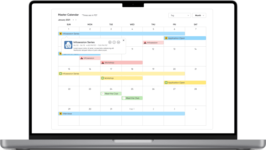
When students navigate to the Recruitment tab, they’ll see a vertical timeline of upcoming recruitment events to accommodate for responsive design. They’ll be able to add these events to their personal calendar, see the Facebook event, and access the Zoom link here as well.
When students navigate to the Recruitment tab, they’ll see a vertical timeline of upcoming recruitment events to accommodate for responsive design. They’ll be able to add these events to their personal calendar, see the Facebook event, and access the Zoom link here as well.
Applicant dashboard
Applicant dashboard
When a student logs into their account, they’ll see a list of events to quickly remind them what’s coming up. They can add and/or move clubs along in their process in the Application Tracker Board to help them stay organized during recruitment season.
When a student logs into their account, they’ll see a list of events to quickly remind them what’s coming up. They can add and/or move clubs along in their process in the Application Tracker Board to help them stay organized during recruitment season.
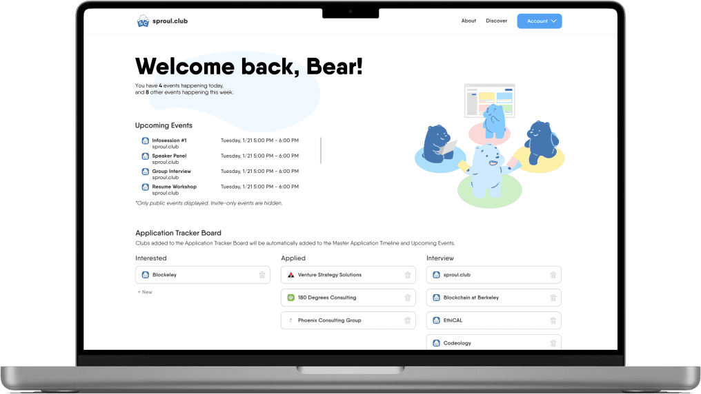
At the end of the dashboard, they can view the calendar of recruitment events, which they can filter by tags, to help them plan their schedules accordingly.
At the end of the dashboard, they can view the calendar of recruitment events, which they can filter by tags, to help them plan their schedules accordingly.

And lastly, students can favorite clubs on their respective club pages for future reference and access that catalog through the Account dropdown in the navbar. They can filter through the catalog to quickly sort through their favorites as well.
And lastly, students can favorite clubs on their respective club pages for future reference and access that catalog through the Account dropdown in the navbar. They can filter through the catalog to quickly sort through their favorites as well.

Success metrics
Success metrics
Making an impact on the community
With the redesign of the club page and implementation of the student dashboard, sproul.club reports:
With the redesign of the club page and implementation of the student dashboard, sproul.club reports:
10k+
10k+
unique users
unique users
from 3k+ unique users in August 2020 after the Beta launch
from 3k+ unique users in August 2020 after the Beta launch
64%
64%
of survey respondents
of survey respondents
use sproul.club as their preferred platform for discovering clubs
use sproul.club as their preferred platform for discovering clubs
I’ve also had some personal interactions with peers who say they exclusively use sproul.club for club discovery or found the community they’re part of now because of sproul.club. It’s extremely heartwarming to hear that and motivates us to keep improving.
I’ve also had some personal interactions with peers who say they exclusively use sproul.club for club discovery or found the community they’re part of now because of sproul.club. It’s extremely heartwarming to hear that and motivates us to keep improving.
Reflection
Reflection
My takeaways
What challenged me?
What challenged me?
It was an incredible experience to work with other designers on one product, but there was definitely a challenge in creating cohesive designs given our different backgrounds and visual styles.
It was an incredible experience to work with other designers on one product, but there was definitely a challenge in creating cohesive designs given our different backgrounds and visual styles.
What could’ve been improved?
What could’ve been improved?
While writing this case study, I realized we needed better documentation of out design decisions to not only understand how we got to the end product, but also for smoother handoff to the next designers/team.
I really enjoyed working on sproul.club since its mission hits close to home. I remember being a freshman and being intimidated by the club scene at Berkeley. I hope with a platform like this in their back pocket, students can find the communities that can really round out their college experiences.